A Featured Title
April 9, 2026
A fuller dek for the featured slot, image flush left, body padded.
Read →

A living reference rendered with the production stylesheet (css/site.css). When the CSS changes, this page changes with it. This is the Frost system (2026-07): a committed cool ground, navy-as-ink, one civic Signal blue, coral kept as editorial heat, and an inverted navy frame. See docs/design-frost-and-inverted-frame.md for the rationale and _designsystems/SUPER_PAGES.md for the pattern.
Frost palette, defined as custom properties in the :root block. Ratios are computed WCAG 2.1. Rules: no pure black or white anywhere; links speak Signal on paper and Signal-40 on navy; coral is editorial heat only, with the text-grade --coral-text for anything at body size. --deep is an alias to --action so legacy references resolve to Signal.
Grounds & surfaces
Text
Action & accent
Planes (navy fields)
Heat (coral) & functional
/* :root in css/site.css — Frost system */
--bg:#DFE8F5; --card:#F4F8FC; --ink:#10294E; --slate:#51617B;
--action:#2A5BC4; --action-dk:#1E56A0; --deep:var(--action); --order:#17457F;
--field:#0C1F3D; --field-text:#F4F8FC; --field-muted:#8FA0BC; --field-action:#5A8FEA;
--field-focus:#5A8FEA; --tint:#EAF0FA; --border:#C6D3E8; --border-strong:#C9DBF4;
--coral:#A84228; --coral-tint:#F4E4DC; --coral-text:#8A3A22;
--ok:#1B6A43; --warn:#8A570A; --error:#B23527;Three families: Archivo (--sans, display + UI), Newsreader (--serif, long-form reading), and Spline Sans Mono (--mono, eyebrows, labels, metadata). All self-hosted, font-display: swap. The mono is the texture that makes the "receipts & rigor" story visible.
Prose paragraph in Newsreader at 1.3rem / line-height 1.7. The concept that seems elusive is usually one good explanation away from obvious.
| h1 | --sans (Archivo), 700, clamp(1.9–2.6rem), line-height 1.15 |
| .home-title | --sans, 800, clamp(2–2.9rem), + Order-blue rule under |
| h2 / .featured-title / .card-title | --sans, 600 |
| .prose p / li | --serif (Newsreader), 1.3rem / 1.25rem, line-height 1.7 |
| eyebrows / credits / dates / bylines / pills / footer | --mono (Spline Sans Mono), uppercase, letter-spaced |
The authored layer that makes the cool ground read as chosen rather than defaulted. Used with restraint — the frame carries the identity, so interior color is punctuation, not decoration.
The inverted navy frame (masthead + footer) is the brand; every page reads like a document in a binder. Coral is the editor's redline — a pull-quote marginal rule, the receipts ethos made visual:
Only real recipes make the catalog. If the web didn't say it, the model doesn't either.
An Order-blue rule punctuates the home title; mono index/metadata reads as instrument data; a ~20px transition band (--field-muted) steps from the pale ground down to the navy footer. Keyline corner ticks are rationed to section openers so the signature stays a signature, not a costume.
No formal step scale; rhythm comes from a consistent set of rem values. Common ones below. Reading column padding is 3rem 1.5rem 4rem (2rem 1.15rem on mobile).
Cards are the content-type separator: every card (Builds + Writing, grid + featured) lifts off the ground into an Ice panel with a hairline border and a hover lift. Images sit flush to the panel and carry a fine hairline so light screenshots get a defined edge. Grid columns are driven by --build-cols (Builds 2-up, Writing 3-up stepping down).
Writing card (date under title, then dek)
Featured card (RAG4 build / newest article)
The flagship composite (/home/): a rotating hero, the title line with its Order-blue rule, supporting copy, and the gift takeaways as an Ice panel with a mono coral key + keyline tick. The hero is random-on-load from a cool-committed Qwen-Image pool (images/home/pool/), each with its own mono caption; no-JS falls back to a default. A weekly Mito cron adds fresh cool shots. The social card (og:image) stays the logo, so sharing is stable. One frozen state shown.
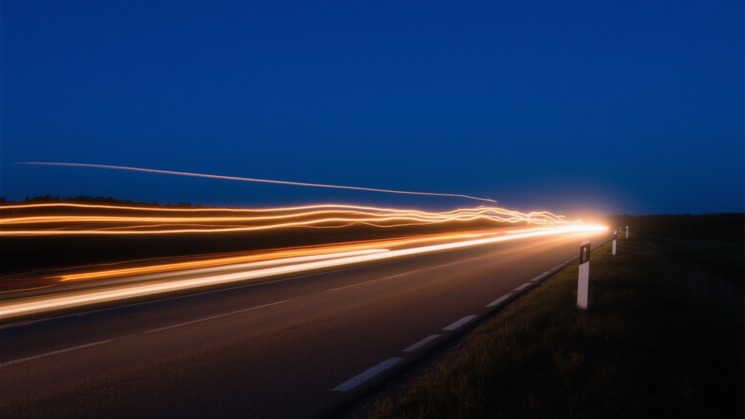
Light trails on a road at night · Qwen-Image · June 2026
I've spent my career working through wicked, complicated problems and making them understandable and usable. Some of the more recent pieces end up here; feel free to learn, and to make things better.
Inputs use --card on a --border-strong hairline; focus shows a Signal ring. Labels are Archivo 500. The honeypot field (.hp) is positioned offscreen.
Long-form lives inside .prose, in Newsreader. Links are Signal, underlined (never color-only). Pull-quotes are the coral redline. Figures are framed as exhibit cards so a screenshot reads as a distinct content type. Also: the implication and rhythm callouts, and the rendered "Ask the books" answer + sources.
A paragraph with an in-text link that is underlined, never color-only.
"AI First puts Humans First."
— Tim O'Reilly
Implication: a per-principle takeaway in a bordered card.
The Rhythm — a process-flow callout on a card.
A closing note, italic slate.
Ask-the-books answer + sources
The synthesized answer renders here as sanitized HTML.
From the books
The inverted navy masthead (--field) is the brand — slim, with the white-filled ru.png mark, muted nav links, and a Signal-40 active item. Focus on dark surfaces uses --field-focus. The footer matches: navy, a ~20px --field-muted transition band above it, and the centered logo over the colophon. Back link on subpages.
Footer (navy + transition band + centered logo)
Mobile menu (hamburger, ≤768px)
Below 768px the nav collapses behind a hamburger (.nav-toggle, light bars on navy) that opens a full-width column; the bars morph to an X on open. JS-gated (html.js). Forced visible here on a navy field:
| --reading | 900px — centered reading column (one consistent width across every page) |
| --container | 1080px — header/footer + home/builds width |
| --build-cols | grid columns (Builds 2, Writing 3), set per-grid |
| breakpoint 600px | book-grid 4→2, portrait stacks, prose shrinks |
| breakpoint 640px | topic-grid 2→1 |
| breakpoint 720px | home-body 2-col → 1 column |
| breakpoint 760px | writing-featured + build grids → 1 (writing 3→2→1) |
| breakpoint 768px | primary nav collapses to the hamburger (.nav-toggle) |
Keyboard focus is a 3px Signal outline (:focus-visible), promoted to --field-focus on navy surfaces. Status messages use the functional tokens (--ok / --error) plus a Signal loading state. A "coming soon" card dims its tile.
ok — Thank you.
error — Something went wrong.
loading — Asking the books…
Predicted needs, not yet built. Lightweight specs so the visual language is decided before they're needed.
Dark mode
Now cheap: the frame is already Register navy, so dark mode is mostly "promote Frost → Register 90, Ice → Register 80, hold the frame" — a Frost-era rewrite of the mapped-not-inverted block, an evening not a project.
Reverse logo & social card
The masthead logo already works on navy (white fill, verified). The og:image will eventually want the navy-frame treatment — currently mark-on-light, off-brand once the inverted frame is the identity.
Real-metadata index tags
Mono index/file tags on build + writing pages (actual dates / build info, never decorative type). CSS language is defined; needs markup hooks in build.py and the pages.
Tag / topic chips & pagination
Tagging writing by theme (reuse the Glacier chip) and a "more writing" control when the grid outgrows one page (Signal, same as .featured-more).